



Optimizing your product photography for different viewing platforms is a non-negotiable skill in today's digital landscape. The image that stops a scroll on a phone screen needs to be fundamentally different from the one that sells on a desktop product page. The core principle is this: you are not just taking a photo; you are creating a visual experience that must adapt to where and how your customer encounters it.
1. Understand the Core Differences: Mobile vs. Desktop
Before you shoot or edit, you must understand the battlefield.
- Mobile (Primarily Portrait): The screen is small, vertical, and viewed at arm's length. Attention spans are short. Your image needs to be simple, bold, and communicate its message instantly. Tiny details often get lost.
- Desktop (Primarily Landscape): The screen is larger, often horizontal, and viewers have more patience for exploration. You can utilize negative space, showcase finer details, and tell a more complex visual story.
Your entire photography strategy should flow from this understanding.
2. Start with Composition & Framing: Shoot for Both
The most critical step happens before you click the shutter. Plan to capture multiple frames from a single setup.
The Hero Shot for Mobile
When composing, always have a mobile-first frame in mind. Get tight on your subject. Fill the frame with the product or the most compelling portion. Use a clean, uncluttered background-a seamless surface is perfect here, as it eliminates distracting lines and keeps the focus locked. Shoot this as a vertical (like a 4:5 or 9:16 ratio) to dominate a phone screen.
The Detail Shot for Desktop
From the exact same setup, pull back. Capture the scene in a landscape orientation (like 16:9). Show the product in its context. Use the rule of thirds and allow for beautiful negative space that could later hold text. A continuous, multi-functional surface allows you to make this compositional shift effortlessly, offering multiple angles without moving your key props.
Pro Tip: Use a tripod. Compose your tight, vertical mobile shot. Take the shot. Then, without moving the product, simply adjust your camera to a wider, horizontal framing. You now have two perfectly optimized assets from one efficient setup.
3. Master Lighting for Screen Brightness & Glare
Lighting behaves differently on various screens, and your edits should compensate.
- For Mobile (Often Viewed On-the-Go): Boost your contrast slightly. Ensure your shadows aren't too deep, as they can become black holes on a bright phone screen. A well-lit subject with clear definition will "pop" anywhere. Soft, even lighting is incredibly reliable here.
- For Desktop (Controlled Environment): You have more leeway to play with dramatic lighting and mood. Viewers can appreciate subtle textures and gentle shadows because they're not squinting at a glare.
4. Editing & Export: The Technical Nitty-Gritty
This is where you cement the optimization for each platform.
Cropping & Aspect Ratios
- Mobile/Vertical: 4:5 (Instagram feed), 9:16 (Stories, Reels, TikTok).
- Desktop/Horizontal: 16:9 (website banners), 3:2 (standard product galleries).
Sharpening & Detail
Apply sharpening strategically.
- For mobile, a slightly heavier global sharpen can help details read on a small screen.
- For desktop, use localized sharpening. Sharpen only the product's key details (a label, texture, logo) to guide the viewer's eye without making the entire image look unnatural.
File Size & Resolution
- Mobile: Prioritize fast loading. Use efficient compression (like JPEG at 80-85% quality), ensuring no visible artifacts are introduced.
- Desktop: Opt for higher quality (JPEG 90-100%). Websites display larger images here, so pixelation is a bigger risk.
Critical Note: Always export in sRGB. It is the universal color standard for web and prevents your colors from shifting between devices.
5. Platform-Specific Optimization
Think about where the image will live.
- E-commerce Product Pages: Use a bold vertical thumbnail in the grid. On the product page, offer a high-res horizontal main image, followed by zoomable detail shots and lifestyle context shots.
-
Social Media (Mobile-First):
- Feed/Carousel: Lead with your strongest, simplest vertical image. Use subsequent images to show details or the wider desktop shot.
- Stories/Reels: This is pure vertical territory. Use dynamic footage or a striking still. Keep text and graphics in the center "safe area" so they aren't cut off.
- Email Marketing: Assume mobile-first. Use a single, compelling vertical image at the top. Make any CTA buttons large and easy to tap.
6. The Foundation: A Consistent, Adaptable Workspace
The secret to efficient multi-platform photography is your foundation. A chaotic or limited backdrop forces you to create entirely separate shoots for mobile and desktop, wasting time and diluting your brand consistency.
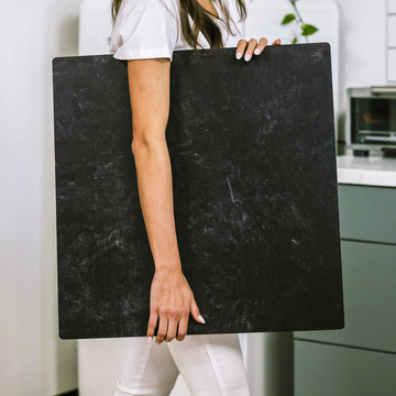
The right tool changes the game. A truly multi-functional surface acts as a continuous canvas. You can shoot a tight, overhead vertical shot for mobile, then simply slide your product and adjust your camera angle to capture a beautiful, wide-angled horizontal shot for desktop-all without changing a prop or losing your cohesive aesthetic. This efficiency is how savvy creators maintain a stunning, consistent brand image across every platform without multiplying their workload.
Your Final Pre-Publish Checklist
- Mobile: Cropped to a vertical ratio? Subject dominant and instantly clear? Contrasts strong?
- Desktop: Utilizing a wider frame? Does the composition have breathing room and guide the eye? Fine details sharp?
- Both: Color profile set to sRGB? File size optimized for web? Image proofed on an actual phone and monitor?
By tailoring your photography to the platform, you move from simply displaying a product to creating a seamless visual experience for your customer, wherever they are. You stop the scroll, you engage the browser, and you build a professional brand that looks impeccable everywhere. That’s the power of optimized, intentional photography.
