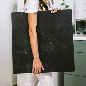
When it comes to product photography, most people think the answer lies in fancier cameras or brighter lights. But in reality, the backdrop you use can quietly make or break your results-especially if you care about accuracy, professionalism, and building trust with your customers. Among backdrops, the Kate brand is a favorite, and there’s more happening beneath the surface of those beautiful designs than meets the eye.
Sure, you’ll find plenty of advice online telling you to “pick a color you like,” but there’s so much more than color at play. Your backdrop’s material, its texture, and even how it responds to your lights all directly influence how your product looks on screen-and how it sells.
There's a Science to Your Surface
Every Kate Backdrop is the product of thoughtful material science. Whether you’re choosing polyester, plush velour, or premium microfiber, what you’re really deciding on is how light will interact with your backdrop and your subject.
- Matte microfiber: Scatters light softly and evenly. This helps prevent shiny glare, pulling your product into the spotlight-just be aware that the backdrop can sometimes absorb certain hues, introducing subtle color shifts.
- Velour/plush: Think of this as the ‘black hole’ of the backdrop world. It absorbs stray light, making colors deeper and shadows crisper. Ideal for dramatic photos, but be mindful: lighter objects may need a little extra light to avoid disappearing into darkness.
Testing Color Accuracy: A Five-Minute Fix
Worried that your turquoise might turn teal on camera? There’s an easy way to check. Just lay a white balance or gray card onto your backdrop and shoot it under your regular lighting setup. Then, in your favorite editing software, check whether that card looks truly neutral. If you spot color shifts, a quick white balance fix or minor lighting adjustment can get your colors back on track.
Lighting and Backdrops: The Ultimate Duo
Lighting isn’t one-size-fits-all, especially when working with different Kate materials. The right modifier brings out the best in each backdrop type:
- Softboxes & umbrellas: Great for reducing harshness on matte backdrops, these tools create velvety shadows and dreamy highlights.
- Hard, focused lights: Ideal for emphasizing brushstroke details on hand-painted Kate backdrops-just keep an eye out for wrinkles!
- Gobos & flags: Creative tools for shaping light and shadow, especially when paired with the extra light-absorbent velour backdrops for a high-drama editorial look.
A Clever Trick for Standout Images
For a moody, high-art feel, try combining a deep, velour Kate Backdrop with a narrow spotlight. The result? Your product pops against a beautifully dark background-plus, you’ll stand out from the flood of plain white Etsy photos.
Don’t Ignore Color Management!
One often-overlooked truth: Every backdrop, no matter how premium, can subtly alter the true color of your products. Consistency is key for keeping shoppers happy and your brand looking professional. Treat your backdrop like an essential part of your color workflow, not just the background of your photo.
- Shoot a color target: Photograph a color calibration card on your backdrop with your full lighting setup in place.
- Build a custom profile: In programs like Lightroom or Capture One, use your card to create a custom profile for each setup. Your photos will look authentic and true-no more “not as described” complaints.
- Match materials to moods: Matte backdrops give soft, organic vibes, perfect for handmade products. Slick or shiny setups deliver punchy contrast-just choose what fits your brand.
Going Pro? Try a Spectral Approach
If you photograph color-sensitive items (like makeup, textiles, or hand-dyed yarn), consider a handheld spectrometer. With a few quick tests, you’ll know exactly how your light and backdrop influence colors, ensuring your customers get exactly what they see.
Your Backdrop is a Creative Partner
In short, your Kate Backdrop isn’t just a background-it’s a carefully crafted tool that affects every shot you take. Test it, tune it, and let it help tell your brand’s unique story. With a little curiosity and the right approach, you’ll turn every photo into something that’s both beautiful and true to life.
Curious about real-world results or want a step-by-step lighting and color guide? Drop a comment below and stay tuned for more hands-on tips coming soon!


