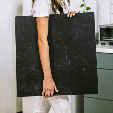
When most people think about photography background boards, the first thing that comes to mind is a decorative perk-a stylish slab of faux marble for pastry shots or a rustic wood grain behind handmade jewelry. But if you see these boards as nothing more than pretty props, you’re missing out on a whole world of creative control. In reality, background boards are unsung heroes that directly shape the look, mood, and professional polish of your images.
Behind every stunning product photo is a partnership between camera, lighting, and an intelligent choice of surface. The kind of board you use isn’t a background character-it’s a silent director, quietly influencing everything from color accuracy to how viewers feel about what they’re seeing. Let’s lift the curtain and discover just how powerful a thoughtfully chosen photography board really is.
Beneath the Surface: How Boards Shape Light and Mood
Ask any experienced photographer and you’ll hear a lot about softboxes and reflectors. Yet, your choice of board can make or break your lighting setup, sometimes in ways that are invisible until you compare two shots side by side.
- Texture Matters: Matte boards scatter light and create gentle, forgiving shadows-perfect for cozy food photography or showcasing subtle product details. Glossy surfaces, on the other hand, bounce light directly and add eye-catching highlights that draw the viewer in.
- Directional Patterns: Boards with pronounced grain or a linen texture channel light along certain lines. This can subtly direct the viewer’s gaze toward your subject without any obvious signposting.
Don’t Overlook the Edge
Most people set their product down and never think twice about where the board ends. But beveled or curved edges can soften the transitions between surface and background, adding a vignette effect that pulls the subject forward. Try pairing two boards at a right angle; you’ll notice immediately how the junction creates natural shadowing and visual depth.
Color Isn’t Just for Style-It’s for Mood
Every color reflects light a little differently, meaning your board can actually cast a subtle hue onto your subject. Want your lip balms to look inviting? Opt for a warm-toned board. For a cool, modern vibe, reach for slate or steel. Boards with layered pigments or a touch of translucency can lend a soft halo effect that makes your photos look high-end, no Photoshop required.
Boards as Visual Storytellers
Backgrounds aren’t neutral. A surface choice adds an essential context and shapes your story-sometimes without you even noticing.
- Rustic wood or stone: evokes authenticity and warmth. Ideal for artisan foods or small-batch wares.
- Polished cement or acrylic: signals luxury and modernity. Perfect for tech, beauty, or high-end accessories.
Even your product’s placement on the board can play with lines and color transitions, gently nudging what your audience notices first and how they feel about the scene.
Next-Generation Boards: Modular, Functional, and Smart
The most inventive creators are stretching what’s possible by using boards that do far more than just sit pretty. Modular systems, like the Replica Studio, allow you to snap, stack, and reconfigure backgrounds at will for speedy scene swaps or layered effects.
- Magnetic joins: ensure seamless corners and believable shadowing for realistic sets.
- Specialty surfaces: Some boards now include embedded fibers that shimmer under proper lighting, or feature anti-glare and easy-clean finishes that stay flawless through marathon shooting sessions.
- Future features: Keep your eye out for boards with AR markers or smart overlays-great for techy workflows where digital elements or color corrections are part of the process.
Pro Tips: Make Your Boards Work Harder
- Mix surfaces for dynamic light: Use a matte board as your base and position a glossier one upright nearby to create clean rim lights and richer shadows.
- Control vertical shadows: Place an extra board just off-frame above your setup. This helps tame harsh lighting and adds a professional moody touch to flatlays.
- Work the edge: For deeper visual impact, photograph your subject near a board junction-this naturally vignettes your scene and builds drama.
- Play with color: Angle colored boards to softly tint your highlights and shadows, adding subtle mood without touching your image in post.
Final Thoughts
The perfect background board isn’t just a canvas-it’s an active participant in every shot you take. By giving attention to color, texture, edge design, and even modularity, you unlock a toolkit for storytelling, mood creation, and professional polish. So next time you set up for a photoshoot, think of your board as a creative partner-not a prop. That’s where the magic starts.
Want to share your favorite board hack or the story behind your go-to surface? Drop a comment below and let’s spark some new inspiration together!


