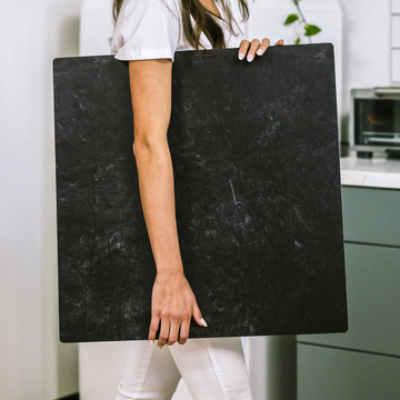
Most advice about product photography backgrounds boils down to a few basics: keep it tidy, use a neutral palette, and steer clear of clutter. But what if your background could do so much more than simply stay out of the way? In the hands of a thoughtful creator, the surface behind your product isn’t just a backdrop-it’s a visual powerhouse, quietly shaping your brand’s entire story.
As someone who has styled countless product photoshoots, I know the surface you choose can completely transform how your products are viewed, felt, and remembered. It’s a subtle art and a secret weapon that any maker, artist, or small business owner can harness. Let’s explore how backgrounds can become one of the most strategic assets in your photography.
Backgrounds as Storytellers
Your background doesn’t just set the stage for your item; it creates an emotional context. It’s almost like a supporting character in a film-one that helps immerse your customer in the world you’re creating.
- Sun-bleached linen & gentle light: Your mug or candle invokes cozy mornings and lazy Sundays. Buyers imagine themselves enjoying slow, comforting rituals.
- Moody slate & strong directional shadows: Suddenly, your product feels urban, stylish, and cutting-edge-a fit for the minimalist or the trendsetter.
By being intentional with surfaces and lighting, you can authentically “set the clock and place” for your audience, with just a subtle change in background.
Manipulating Perception Through Material and Light
Here’s a detail most people miss: different backgrounds actually change how your product looks. Shiny items reflect the world around them, pulling in soft hints of color and personality from your surface. Choose a cool blue backdrop and suddenly your delicate silver ring feels sleek and modern. Pick a creamy, textured board and it radiates warmth and approachability.
And the surface finish counts just as much. Matte, textured backgrounds, like concrete or artisan-painted panels, toss little shadows under your products, making them feel grounded and substantial. With glossy acrylic, those shadows vanish and your product seems to almost float. This can feel futuristic-or, sometimes, disconnected if used without purpose.
Try this experiment: Shoot your product on three distinct surfaces-one glossy, one matte, and one somewhere in between. Notice how the change in texture and reflectivity subtly shifts the product’s mood and perceived value, no editing required.
The Case for Blending Over Contrast
Most think a product should always pop off the background. But here’s a secret from luxury brands: sometimes, blending is better. When you match your background closely to your product’s hue or material, there’s a soft, elegant mystery. It slows down the viewer, encouraging a longer gaze-a powerful trick for conveying premium quality.
A perfume bottle on a pale silk, a notebook on smooth tan leather-these combinations draw viewers in, making them linger longer and feel that the brand is both thoughtful and elevated.
Signature Surfaces as Brand DNA
What if your background became as recognizable as your logo? Consistency in your surfaces-whether it’s a signature color, a unique texture, or even a specific material-helps build a visual anchor for your brand. Over time, customers recognize “your look” before they spot your name.
- Painted plywood, marbled boards, or distinctive wallpapers can all serve as signature surfaces.
- High-quality modular backdrops, like those from Replica Surfaces, can help you create a consistent vibe across product launches and seasonal collections.
The right background doesn’t just hold your product up. It signals professionalism, care, and a cohesive brand identity.
Building Your Background Toolbox
Ready to level up your product backgrounds? Here’s where to start:
- Audit your current product photos. What is your standard background communicating? Is it setting the right mood, or just filling space?
- Try three fresh textures. Aim for one smooth (for a floating effect), one textured and matte (for grounding and luxury), and one that closely matches your product (for soft blending).
- Create or invest in a signature surface. Use it consistently to strengthen brand recognition.
- Play with lighting direction and intensity. Watch how surfaces and shadows can add drama-or create gentle, lifestyle vibes.
Your Background: The Brand Voice You Never Knew You Had
Every detail in your product photography speaks volumes. Don’t let your background be an afterthought. Whether you lean modern, rustic, soft, or bold, your surface choice has the power to tell your story, enhance perceived value, and build a visual world your customers want to step into.
Have your own background styling tip or want to share your results? Drop a comment below-let’s inspire each other to go beyond the basics and let our backgrounds speak up!


