Flat lay photography has become a staple for makers, creatives, and small business owners. But while most guides talk about pretty arrangements and seasonal color trends, there’s a hidden science to prop selection that separates eye-catching images from truly brand-building, high-converting photos.
Today, we’re moving beyond surface-level tips and diving into how psychology, design, and a strategic approach to flat lay props can transform your product images-and your business. Let’s take a closer look at the real reasons your props matter.
Props with Purpose: Setting the Scene and Telling a Story
Every prop you add to a flat lay sends a message. In psychology, this is known as visual affordance-the way an object naturally suggests its use or associated feeling. Imagine placing a steaming coffee mug beside a handmade journal and a candle. Instantly, your audience starts envisioning slow mornings, warmth, and relaxation without a single word of copy.
Instead of filling empty space, choose props that evoke the mood, emotion, or story you want your customer to experience. Ask yourself: What do I want this image to make someone feel? Then, curate your props to spark that emotional response.
The Power of Color Consistency: Building Trust with Every Image
Your brand’s colors aren’t just for your logo-they’re your invisible handshake, building trust and recognition instantly. Props that echo your core palette help your entire feed or shop feel polished and cohesive. Customers may not consciously notice subtle color harmony, but it reinforces their confidence in your brand.
Before you shoot, gather your brand colors. Use them to guide your selection of napkins, ceramics, ribbons, and textures. When your flat lays feature props that match your overall look, your photos become unmistakably yours.
- Use tools like Adobe Color or a color picker to swatch your main hues.
- Stick with props that share the same undertone (warm, cool, or neutral).
- If in doubt, keep to a small color palette for each shoot to maintain harmony.
Texture: The Secret Weapon for Luxe Photography
Texture isn’t just visually interesting-it literally changes the way light interacts with your photo. By combining matte, glossy, soft, and hard props, you introduce depth and richness that can elevate even the simplest subject.
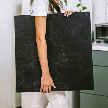
Consider the difference between a ceramic cup on a sleek marble Replica Surface, paired with a crumpled linen napkin and a glass pendant. Each surface creates a unique highlight or shadow, and together, they make your main product shine.
- Gather props with a mix of finishes: glass, linen, wood, metal, and ceramics.
- Turn on a flashlight or move your scene near a window-notice how each material catches the light.
- Choose 2-3 supporting textures per flat lay for interest without clutter.
Every Prop is a Symbol: Using Visual Language to Connect with Your Audience
Great product photographers understand that props carry meaning. A sprig of rosemary with handmade soap, a brass pen with a leather notebook, or recycled paper tags with sustainable products-these subtle touches tell your customers something about your values and story.
Think deliberately. What signals do your props send to customers? Are they consistent with the message you want to share? Lean into recurring objects or motifs that encapsulate your brand personality. Over time, they become visual shorthand for your audience.
Testing for Impact: Let Your Audience Guide You
The final, rarely discussed ingredient: measure what works. Don’t just trust your gut when selecting props-watch what actually gets clicks, shares, and sales.
- Shoot two versions of your product photo with different prop arrangements.
- Post them separately on social or rotate them on your online shop.
- Pay attention to what generates more engagement, saves, or purchases.
This simple A/B testing can reveal which colors, stories, or textures truly connect with your real audience. Over time, you’ll refine your style based on hard evidence-not just trends or personal taste.
Recap: Curate, Don’t Clutter
Every flat lay prop should earn its place. Whether you’re signaling cozy mornings, refined minimalism, or earthy authenticity, make each choice intentional and on-brand. When you curate with strategy-instead of just decorating-you transform your images from generic to powerful business tools.
- Start with the story: What feeling or action do you want to inspire?
- Cohere your color schemes for true brand unity.
- Layer in textural contrast for richness and value perception.
- Choose props that are symbols, not just decorations.
- Test, measure, and evolve-let your analytics inform your styling.
Ready to step up your product photography game? Start curating your prop kit and watch your photos-and your brand’s impact-soar.


