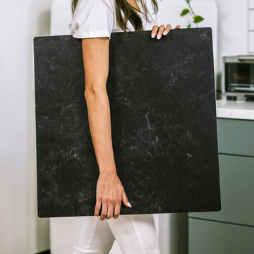
When it comes to product photography, most of us obsess over lighting and cameras, but there's an unsung hero working quietly behind the scenes: the humble backdrop. While many photographers pick surfaces for convenience or pattern, few take a closer look at what makes some backdrops truly exceptional. Let’s dive deep into the hidden science behind Kate Backdrops and why they’re the secret weapon in a modern product photographer’s toolkit.
If you think all backdrops are created equal, think again. There's a reason professionals turn to Kate for their most color-critical shoots-and it has everything to do with smart fabric technology, print science, and optical precision. These may sound like buzzwords, but when you’re shooting dozens (or hundreds) of products, tiny differences add up fast.
The Fabric Edge: Why Microfiber-Polyester Matters
Not all surfaces play nicely with light. Kate Backdrops are made with a custom microfiber-polyester weave that does more than look good-it actively shapes how light behaves in your shot.
- Minimal Glare: Kate’s fabric has ultra-low reflectivity, so you never have to worry about distracting bright spots hijacking your product photo.
- Soft, Diffused Shadows: The microfiber threads gently scatter the light, creating flawless transitions and a natural 'pop' for your subject. This is particularly valuable when your product has curved edges or reflective surfaces.
- No Unwanted Color Casts: Forget about color bouncing unpredictably onto your subject; this fabric absorbs just enough ambient light for cleaner shadows and truer color.
If you’re used to fighting stubborn highlights or color pollution, shooting on Kate feels like getting an instant Photoshop pass.
Color Science: How Dye-Sublimation Sets Kate Apart
Keen eyes notice the difference as soon as they look at their files. Kate’s dye-sublimation printing process infuses color deep into the fabric-no ink sitting on the surface, and no peeling or fading with time.
- Rich, Accurate Color: The dye permeates the fibers for punchy but authentic hues, true to life under any kind of lighting.
- Consistent Across Light Sources: Colors hold steady under flash, LED, or daylight-critical for shoots where lighting might change as the day wears on.
- Smooth Gradients: You won’t see ugly banding or digital artifacts. This makes Kate especially suited for backgrounds with subtle texture or ombré effects.
When your brand depends on consistent, vibrant images-whether it’s handmade ceramics, food, or cosmetics-this attention to color detail is worth its weight in gold.
Workflow Wins: Editing Is Faster and Easier
Let’s get practical. A backdrop is only as good as the workflow it creates. Here’s where Kate really shines for digital photographers:
- Precise Selections: The non-reflective, finely woven surface helps your editing software distinguish edges, so masks and cutouts become a breeze-even with detailed objects.
- Consistent Color Profiles: Create a custom ICC profile with a color checker and enjoy uniform color on every shoot. Kate’s stable reflectance makes repeated, accurate edits an everyday reality.
- No Annoying Color Spill: Bold backgrounds (like deep black or pure white) don’t reflect back onto your products, saving you time in post-production correction.
For high-volume catalog shoots, or anyone who hates repetitive corrections, the time savings here are huge.
Creative Flexibility: Layering and Experimentation
Think backdrops are boring? Think again. The unique fabric texture of Kate opens up in-camera tricks that other materials struggle with:
- Layer sheer fabrics or gels right over your Kate backdrop without worrying about static or lint issues-mixing color looks is simple and clean.
- The fast, consistent surface means digital compositing (including double exposures or masking) is more convincing, with fewer digital artifacts to fix.
In short: you’re not limited to what’s printed on the surface. Experimentation is encouraged, not punished.
The Bottom Line: Why All This Science Matters
If you’re photographing products for Etsy, your own shop, or major ad campaigns, the difference between “pretty good” and “brand-defining” can come down to your choice of backdrop. Kate Backdrops aren’t just practical-they remove barriers between what your eye sees and what your client gets, collapsing the post-production headache into a streamlined, reliable workflow.
Don’t take our word for it. Next time, drop a color checker next to your product on a Kate backdrop. Compare the result to your other surfaces. You’ll spot the crisp edges, true colors, and less time spent on post-processing-and that’s not just good science, it’s good business.
Have questions or want a deeper dive into color profiling with Kate backdrops? Drop a comment! Let’s make every shot a step closer to your vision.


