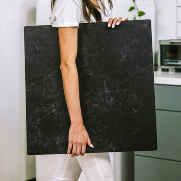
Every creator knows that a good backdrop can make or break a product photo. But what if there’s more to the story? If you’re shooting for Instagram, the secret isn’t just about finding something “pretty”-it’s about understanding the science behind light, texture, and even how Instagram’s own algorithms compress your images. Small tweaks can have a big impact, helping your photos look as stunning on your audience’s screens as they do in real life.
Let’s pull back the curtain and dive deep into why the right backdrop board might be your strongest tool for standing out-or blending in-on the world’s most visual platform.
Why Backdrops Matter More Than You Think
It’s easy to think of backdrop boards as basic: just a background, right? In truth, their surface and material qualities affect how light interacts with your scene and how your image survives the digital journey through Instagram’s compression. These hidden aspects influence everything from subtle color tones to how sharp your products appear against their backgrounds.
The right choice acts as both stage and spotlight for your brand-if you know what to look for.
The Instagram Compression Dilemma
Have you ever noticed that your photos look different after you upload them? That’s not just your imagination. Instagram’s algorithms are designed to shrink, compress, and subtly alter images so they load quickly and display well on millions of devices. The result?
- Textural detail-like fine marble veining or natural woodgrain-can vanish or turn blotchy.
- Soft neutral colors might become dull or take on odd hues.
- Once-crisp edges suddenly get fuzzy or show strange digital halos.
These quirks mean you need to choose and use backdrops with compression in mind-before you ever press the shutter button.
How the Pros Pick Their Backdrop Boards
- Matte Over Gloss: Glossy boards can look beautiful in hand, but direct lighting often leads to distracting glare spots. These don’t survive Instagram’s compression, resulting in blown-out areas that distract from your product. Matte backdrops diffuse light, keeping everything even and vibrant from camera to screen.
- The Just-Right Texture: A hint of texture adds realism, but too much can be lost in upload, or worse-turn to mush. Professional boards strike the perfect balance, offering visible depth at the size (1080x1080px) Instagram uses, without overwhelming fine details.
- Choose Compression-Survivor Colors: Subtle pastels and soft whites may look dreamy in real life, but can become muddy online. Mid-tone neutrals and stronger colors generally remain truer after upload. Testing your favorites directly on Instagram is worth the effort.
Optimizing Lighting and Shadow for Digital Delivery
Surface finish isn’t the only thing that matters. Lighting changes everything, especially with today’s phone screens and compressed images. Here’s how to give your photos that irresistible, professional pop:
- Diffuse your light using softboxes, sheer curtains, or reflector boards. This keeps shadows gentle and colors true, while minimizing harsh reflections.
- Watch your angles: Even textured backdrops can look flat if the light is too direct. Experiment with side lighting to reveal just enough surface detail without creating distracting shadows.
Why Consistency Is Branding Gold
Switching up backgrounds for every shot might sound fun, but a consistent look carries serious benefits:
- Your feed becomes instantly recognizable at a glance-building trust and making your brand more memorable.
- Instagram’s algorithms process repeated textures and tones more predictably, reducing unwanted color or quality shifts post-upload.
Find a “hero backdrop” that expresses your brand style, then use it as your visual anchor. Small business owners who adopt this approach report stronger engagement and faster audience growth.
A Proven Workflow for Standout Instagram Photos
- Choose a well-crafted, matte, mid-tone backdrop that fits your products and main palette.
- Shoot test images and upload them privately to see how compression affects your detail and color.
- Control your light with diffusers and bounce boards. Avoid harsh spots by testing different lighting angles.
- Batch your shoots, maintaining the same backdrop and setup for visual consistency.
Takeaway: Backdrop Boards as Branding Power Tools
Great Instagram photos aren’t just born in editing apps-they’re engineered right from your set. By choosing backdrops with the right materials, colors, and textures (and using them intentionally), you can outsmart compression, elevate your products, and create cohesive, scroll-stopping images every time.
Curious about which boards work best or want to share your favorite tips? Join our community and connect with other creators who are mastering the art and science of in-home photography. Your next breakthrough might be just a backdrop away.


