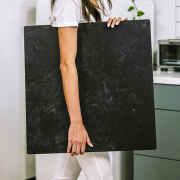
Let me tell you a secret that transformed my product photography: your background isn't just empty space - it's your most powerful storytelling tool. I learned this the hard way after wasting countless hours fixing mediocre photos in post-production, only to realize the problem wasn't my camera or lighting - it was what was behind my products.
Why Your Background Choice Makes or Breaks Your Photos
After shooting thousands of product images, I've discovered three universal truths about backgrounds:
- Texture creates credibility - Real surfaces photograph differently than digital ones
- Color influences perception - That "premium" look starts with your backdrop
- Transition matters more than you think - How your surface meets the background affects depth
The Texture Trap Most Photographers Fall Into
Early in my career, I made every mistake in the book:
- Using cheap poster board that reflected weird color casts
- Choosing busy patterns that competed with my products
- Shooting on surfaces that looked obviously fake in photos
The breakthrough came when I started treating backgrounds like active participants in my compositions rather than passive elements. Here's what changed:
Professional Background Selection: A Practical Guide
These are the techniques I now use for every shoot:
- Start with your product's personality - Is it rugged? Luxurious? Handmade?
- Test lighting interactions - Some surfaces absorb light while others bounce it
- Consider the customer journey - Where will these photos ultimately be seen?
Remember: Your background should complement, not compete. The best surfaces disappear just enough to let your product shine while still adding subtle depth and context.
Common Mistakes (And How to Fix Them)
If your product photos feel "off" but you can't pinpoint why, check for these issues:
- Overly bright whites that flatten dimension
- Unintentional reflections that distort colors
- Harsh transitions that make products look pasted on
The solution? Test before you shoot. Move your product around the surface, watch how light interacts, and adjust accordingly. Your camera sees differently than your eyes.


