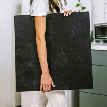
Ever taken what you thought was the perfect product shot, only to realize something feels... off? More often than not, the missing piece isn't your lighting or composition - it's your background. That silent partner in every product photo actually makes or breaks your image more than you'd think.
Why Your Backdrop Isn't Just a Background
Most photographers obsess over lighting and props while treating the background as an afterthought. Big mistake. Your backdrop actually does three crucial jobs:
- Controls how light interacts with your product
- Sets the emotional tone of your image
- Subtly influences buying decisions
The Material Matters More Than You Think
Not all surfaces play nice with light. Here's what happens with different materials:
- Glossy surfaces (acrylic, vinyl) create punchy reflections but can look cheap if overdone
- Matte finishes (paper, fabric) give you soft, natural-looking shots but can flatten depth
- Textured hybrids (like Replica's surfaces) offer the perfect middle ground
Color Psychology: Your Secret Weapon
White and black are safe, but boring. Want to make products irresistible? Try these pro moves:
- Use monochromatic tones for luxury appeal (think varying shades of slate gray)
- Try complementary colors to make products pop (a muted teal makes gold jewelry shine)
- Leverage psychological triggers (warm wood = authentic, cool gray = modern)
3 Tricks to Fake Studio-Quality Depth
Flat-looking product photos scream "amateur." Here's how the pros create dimension:
- Angle your backdrop downward to create space illusion
- Use gradient lighting (darker edges, brighter center)
- Elevate products slightly for natural shadow depth
Remember: Your background isn't just behind your product - it's part of your product's story. Choose wisely, and watch your conversion rates climb.
Want to take this further? Check out our advanced styling guide for more insider secrets.


