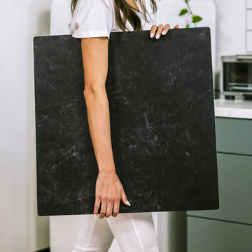
There’s a reason subway tile remains a darling of the product photography world. Its crisp, modern look seems effortless on the surface-but beneath that polished exterior lies a complex backdrop that seasoned photographers know is anything but simple. If you’re ready to move from ordinary to extraordinary, it’s time to peel back the layers and tap into the hidden power of the subway tile backdrop for your next shoot.
What Makes Subway Tile So Special?
Sure, it’s clean and familiar, but subway tile brings far more than neutrality or aesthetic trendiness. Look closer, and you’ll discover a surface that interacts with light, color, and composition in subtle-and surprisingly creative-ways. Master these elements, and you can unlock photo results that are anything but generic.
1. Micro-Texture Magic
You might assume tile is always perfectly smooth, but even “pristine” surfaces hide tiny ripples, glaze variations, and faint grout textures. These details may be invisible until you put lights on them-but trust us, your camera picks them up:
- Diffuse harshness: That micro-texture catches light differently at every angle, softening reflection and adding gentle depth-especially useful for glass, high-shine packaging, or metallic products.
- Low-angle lighting: Try positioning your main light just above the tile and off to one side. The interplay between light and texture will subtly lift your product off the background, creating dimension that makes your images feel more alive.
2. Reflections and Glare: A Double-Edged Sword
A glossy tile backdrop can be a lighting dream or your worst enemy, depending on how you tame it. Sometimes those reflections highlight luxurious materials, other times they distract or obscure your product. The trick is in your control:
- Use a circular polarizer: Twisting a polarizing filter on your lens lets you dial in the exact amount of shine, softening glare without losing that beautiful sense of “ceramic” life.
- Play with bounce cards: White (or subtly colored) foam core, placed opposite your main light, both fills dark shadows and tones down sharp tile reflections. You can shape the whole mood with something as simple as a piece of cardboard.
3. Not All Whites Are Created Equal
Here’s something even many pros overlook: subway tile “white” isn’t universal. Depending on the manufacturer, glaze, or even the color of grout, you’ll see warm creams, cool blues, or subtle greys-each of which can impact how your product’s colors come across on screen.
- Set custom white balance: Always use a grey card right on your tile before each shoot so your colors stay accurate-especially when color is central to your product’s appeal.
- Mask for post-production: In editing, treat product and background as separate layers. This lets you tune the tile’s color or neutrality without sacrificing the true tones of the product itself.
4. Mastering the Grid: Geometry as Storytelling
The iconic “grid” of tile and grout isn’t just architectural-it’s a ready-made design element. Leveraged thoughtfully, it can pull the viewer’s eye straight to your hero product or subtly reinforce your brand’s vibe.
- Lead the gaze: Align product placement with the grout’s natural lines, guiding the viewer’s attention right where you want it.
- Creative misalignment: Not every shot needs to be perfectly square. Angling your camera so tile lines run diagonal can inject instant energy and create a sense of movement or edge.
- Attention to precision: Tiny misalignments can create a subtle sense of unease. Use overlays or guides in your editing workflow to ensure everything is straight and intentional.
5. Branding Through Surface Selection
Don’t underestimate what your choice of backdrop says about your business. Shiny, flawless white tile speaks to cleanliness, clinical precision, or luxury. Tone-on-tone grout, handmade tile, or a little visible age? That’s warmth, authenticity, or small-batch charm. How you style and light those imperfections can become a key part of your visual signature.
- Add character: Sometimes a tiny bit of water on grout, a shadow from a nearby object, or the faint patina of older tile tells a richer story than anything stock-perfect ever could.
Small Details, Big Impact
It’s easy to think of subway tile as a cliché. But in skilled hands, those glossy rectangles become a canvas for depth, narrative, and subtle brand storytelling. Pay attention to the micro-texture, reflections, color balance, and the geometry of your composition-you’ll quickly see just how much more your product shots can offer.
Ready to try it for yourself? Share your work, tag your photos, or reach out for lighting diagrams, editing tips, or tailored setup guides. Sometimes the difference between a photo that’s “nice” and one that’s unforgettably pro is just the space of a grout line-and the eye that notices it.


