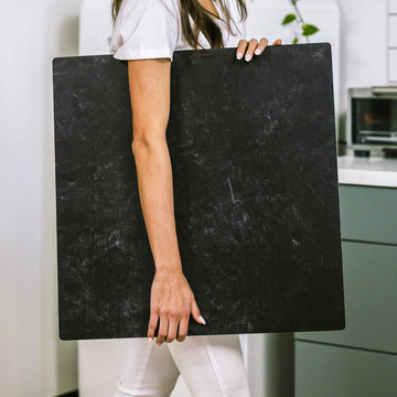
Let's be honest - in the crowded world of Instagram, your backdrop makes or breaks your content. It's not just a background; it's the silent salesperson for your brand, the mood-setter for your aesthetic, and the secret sauce for algorithm love.
Why Your Backdrop Choice Matters More Than Filters
Most creators obsess over lighting and editing while treating their backdrop as an afterthought. Big mistake. Your backdrop:
- Controls the emotional tone of your image
- Enhances (or ruins) your product's colors
- Builds instant brand recognition
The Psychology of Color & Texture
Different surfaces trigger different emotions:
- Warm tones (wood, terracotta) = cozy & handmade
- Cool tones (concrete, slate) = modern & luxe
- Textured surfaces add depth and realism
Lighting Secrets the Pros Won't Tell You
That gorgeous marble backdrop might look terrible if you don't understand these lighting rules:
- Matte surfaces absorb light = softer shadows
- Glossy surfaces reflect light = risk of glare
- Dark backdrops need fill lights to avoid muddiness
3 Backdrop Strategies That Crush the Algorithm
Want that sweet, sweet Instagram reach? Try these:
- The Signature Look: Same backdrop every post (like Glossier's clean white)
- The Rotating Set: 2-3 coordinated backdrops
- The Grid Flow: Alternate light/dark in a pattern
Remember - your backdrop isn't just holding space. It's telling your brand's story, one stunning photo at a time.
What's your go-to backdrop style? Drop it in the comments - let's geek out over textures and tones!


