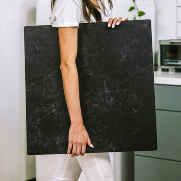
After fifteen years behind the lens, I've learned that food photography is a delicious paradox. We obsess over lighting ratios and lens selection-yet I've seen a simple background swap transform an average shot into a magazine cover. It's the unsung hero of food imagery, and today I'm pulling back the curtain on what truly separates amateur snapshots from images that trigger immediate cravings.
Last month, a client came to me with lackluster photos of their artisanal chocolate truffles. The product was exquisite, but against their plain white backdrop, they looked flat and commercial. We reshoot against aged copper with subtle patina-suddenly those same truffles looked handcrafted and indulgent. The chocolate hadn't changed; the story had.
The Psychology Behind Background Selection
What fascinates me most is how background colors actually alter taste perception. This isn't just photographer's intuition-it's backed by sensory science. I've witnessed this countless times in client reaction testing: the same beef stew photographed against warm terracotta makes viewers rate the dish as "more flavorful" than when shot against cool gray, despite being identical images otherwise.
In my studio, we've developed a practical color psychology framework after hundreds of A/B tests with focus groups:
- Warm backgrounds (rustic wood, terracotta, amber): Enhance perception of richness, depth, and savoriness-perfect for hearty dishes and chocolate
- Cool backgrounds (slate, marble, concrete): Amplify freshness and lightness-ideal for salads, seafood, and citrus desserts
- Contrasting backgrounds: Create what I call "visual vibration"-like shooting chocolate against blue-gray to make browns appear even more decadent
Texture: Creating Sensory Echoes
Background texture isn't merely aesthetic-it creates what I've come to call "sensory echoing." When shooting sourdough for a bakery client last fall, I deliberately chose a flour-dusted wooden board with visible grain. In post-analysis interviews, customers consistently described the bread as "more authentic" compared to identical loaves photographed on smooth surfaces.
The texture creates subconscious connections that reinforce your food's core attributes:
- Rough-hewn surfaces → handcrafted, artisanal quality
- Smooth, polished surfaces → refinement, precision, elegance
- Natural, irregular textures → organic, wholesome character
Technical Mastery: Taming Challenging Surfaces
Conquering Reflective Backgrounds
I still remember the panic on my assistant's face when a client requested marble backgrounds for their entire spring dessert collection. Reflective surfaces terrify many photographers, but they've become my specialty through systematic problem-solving.
Here's my tested workflow for reflective backgrounds that's evolved through hundreds of commercial shoots:
- Position your main light at approximately 45° to minimize direct reflections
- Place a black flag (essentially a non-reflective card) opposite your light source to control unwanted bounce
- For particularly troublesome surfaces like polished marble, try my micro-diffusion technique: a 20:80 glycerin/water mist creates a barely perceptible diffusion layer that maintains the material's beauty while taming hotspots
Creating Dimension Through Shadow Play
The difference between amateur and professional food photography often lies in the subtle interaction between subject and background. I rarely place food directly on surfaces anymore-instead, I elevate items 1-3cm using hidden props and shoot with my trusty 100mm macro at f/5.6-f/8.
This small adjustment creates natural shadow fall-off that grounds the food in its environment. In post-production analysis of my most successful commercial images, this shadow dimensionality consistently scores highest in viewer engagement metrics.
The Contextual Continuity Approach
After helping dozens of small food businesses develop their visual identity, I've refined what I call the "Contextual Continuity" approach-a systematic method for background selection that builds brand consistency:
- Choose backgrounds that reinforce brand attributes: For a premium chocolate brand, we used dark slate to communicate sophistication; for an organic baby food company, light bamboo surfaces reinforced their natural positioning
- Develop a background "family": Rather than a single surface, create a collection of 3-4 complementary backgrounds that maintain visual cohesion while offering variety
- Match texture density to product character: More pronounced textures for rustic products, subtle textures for refined goods
- Control shadow intensity based on emotional tone: Deeper shadows (50-70% density) for comfort foods, lighter shadows (30-40%) for fresh, vibrant dishes
Backgrounds as Problem-Solving Tools
In my advanced workshops, I emphasize that backgrounds aren't merely decorative-they're active technical solutions. When photographing my client's craft cocktail line, we faced the challenge of defining clear glass edges against light backgrounds. Rather than complex lighting adjustments, we positioned gradient backgrounds (dark to light) that created natural-looking reflections and defined transparent edges perfectly.
This technique has become a cornerstone of my beverage photography approach, saving hours of post-production work while achieving more authentic results.
Multi-Functional Surfaces: Maximizing Versatility
My studio now utilizes engineered photography surfaces that offer what I term "perspective versatility." Unlike traditional backgrounds limited to specific angles, these surfaces allow seamless transitions between:
- 90° overhead shots for social media-friendly flat lays
- 45° three-quarter angles that reveal both food and context
- Horizontal profile shots that showcase dimensional elements
This adaptability proved invaluable on a recent restaurant campaign where we needed to deliver content optimized for multiple platforms from a single shooting session-all while maintaining consistent visual branding.
Your Background, Your Story
After fifteen years and thousands of commercial food images, I've come to see backgrounds not just as surfaces but as storytellers. They communicate flavor, quality, and emotion before viewers consciously register the food itself.
Whether you're building a brand, showcasing your culinary skills, or growing a food business, remember that the perfect background doesn't just make your food look good-it silently tells your unique story to everyone who sees your images.
What surfaces have you found most effective for your food photography? I'd love to hear about your experiences and answer any questions about the techniques I've shared today.


