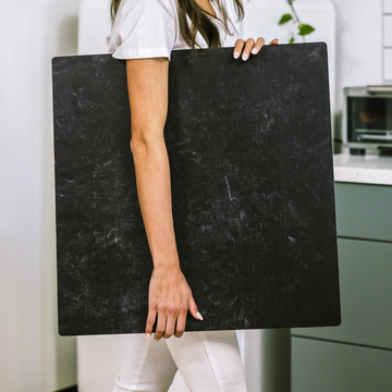
Ever wondered why some product photos just pop while others fall flat, even when using seemingly similar setups? After spending over a decade shooting everything from luxury watches to artisanal cheeses, I've discovered that what often separates professional-quality images from amateur attempts isn't just the camera or lighting-it's a deep understanding of backgrounds.
Today, I'm pulling back the curtain on the technical aspects of product photography backgrounds that most tutorials never mention. These insights have transformed my own workflow and can elevate your next product shoot, whether you're a seasoned pro or just getting started.
The Hidden Physics of Light and Background Interaction
When light hits your background, it doesn't simply bounce off-it engages in a complex dance of physical interactions that dramatically impacts your final image.
What's actually happening:
- Reflection: Light bounces off the surface (specular or diffuse)
- Absorption: Some wavelengths get absorbed rather than reflected
- Transmission: Light passes through (relevant for translucent backgrounds)
- Scatter: Light disperses in multiple directions
This explains why a glossy white background creates a completely different mood than a matte white one. The glossy surface has a high specular reflection coefficient, creating those distinct, mirror-like highlight points that add drama and contrast. Meanwhile, matte surfaces with their microstructural imperfections scatter light diffusely, softening reflections but sometimes reducing overall contrast.
I discovered this principle while shooting a high-end watch collection-when I switched from glossy to matte backgrounds midway through the shoot, the entire mood of the collection changed, even though my lighting remained identical.
The Microscopic World That Affects Your Macro Results
What we casually call "texture" is actually a complex microtopography that significantly impacts your images in ways most photographers never consider.
Even backgrounds marketed as "flat," like popular Replica Surfaces, contain microscopic variations that create what I call "micro-shadowing"-thousands of tiny shadows that add subtle depth and character to your images. This explains why two visually identical white backgrounds from different manufacturers can produce dramatically different results.
When selecting backgrounds, I always run my fingers across the surface and observe how it catches light at extreme angles. These tactile observations tell you more about how the background will perform than what you can see with your naked eye.
Color Science: Why Your "White" Background Might Not Be Neutral
Have you ever shot a product against a white background only to find it has a subtle color cast in the final image? The culprit likely isn't your camera settings-it's the spectral properties of your background.
A background's color isn't simply an RGB value but a spectral fingerprint that determines how it interacts with different wavelengths of light. This becomes critically important when working with mixed lighting sources or when color accuracy is paramount.
For instance, a white background might appear perfectly neutral under 5500K lighting but shift toward magenta under tungsten lighting (3200K) because of its particular spectral reflectance curve. This is why I measure my backgrounds' spectral response rather than simply matching colors visually.
During a cosmetics campaign last year, I discovered that our "pure white" acrylic sheet was actually reflecting a subtle blue cast that made the product packaging look off-brand. A simple spectral measurement would have saved hours of post-processing headaches.
Thermal Considerations: Why Your Background Might Be Moving
During long shoots, the heat from continuous lighting can cause background materials to expand, contract, and sometimes warp. This creates subtle but problematic inconsistencies across multiple product shots-especially noticeable when images are displayed side by side in catalogs or online stores.
This is why I invest in thermally stable composite materials rather than traditional paper or fabric backgrounds. The thermal stability coefficient of your background becomes particularly important when precision and consistency are required across dozens or hundreds of product shots.
I learned this lesson the hard way during a jewelry catalog shoot where subtle background shifts created alignment issues that required extensive post-processing to correct.
The Distance Game: How Background Placement Affects Focus
One of my favorite technical tricks involves manipulating the distance between product and background to control both depth of field and visual relationship.
By precisely calculating this distance rather than arbitrarily placing your background, you can:
- Create natural vignetting that draws attention to your product
- Control how much texture detail appears in your background
- Manipulate the apparent size relationship between product and background
I call this technique "focus plane splitting"-maintaining tack-sharp focus on your product while creating a controlled, slightly softer background even when working with flat surfaces.
Quick Reference: Background Distance Effects
- Close placement (1-3 inches): Maximum texture detail, pronounced shadows
- Medium placement (6-12 inches): Balanced texture and softness
- Far placement (18+ inches): Minimized texture, softer shadows, greater separation
Putting It All Together: The Technical Mindset
What truly separates professional product photographers from amateurs isn't just better equipment or more attractive backgrounds-it's approaching each element as part of an integrated technical system.
The next time you set up a product shot, consider:
- How will this background's specific reflective properties interact with my lighting setup?
- What spectral characteristics might affect color accuracy under my current lighting?
- How stable will this material remain throughout my shooting session?
- What distance will create the optimal relationship between my product and background?
When you approach product photography with this technical mindset, you'll find yourself making decisions based not just on aesthetics but on the physics that govern how your images are formed-and that's when your work truly begins to stand apart.
What backgrounds have you found work best for your product photography? Have you noticed any of these technical aspects affecting your shoots? Share your experiences in the comments below!


