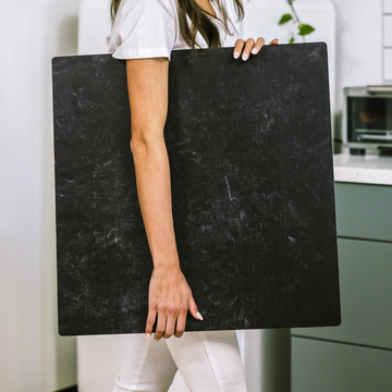
Scroll through Instagram or any recipe blog, and you’ll see food photographed on an endless parade of marbles, rustic woods, and cool slates. But have you ever wondered what really makes one background stand out from another? There’s a world of difference between a quick prop and a thoughtfully chosen photographic surface. Underneath the surface, it’s a blend of science and artistry that separates the amateur from the exceptional.
The journey to a perfect food photo doesn’t begin with the dish-it starts with the backdrop. Select the right one, and your subject pops, textures sing, and colors stay true. Choose poorly, and even the most appetizing cuisine can look dull or uninviting. Today, let’s take a deep dive into the lesser-known factors that turn backgrounds into the secret weapon of food photographers.
Invisible Details: Visual Texture & The Dance of Light
Most people simply say, “Don’t use anything shiny.” But it’s not that simple. The true secret lies in what’s called microtexture-tiny peaks and valleys on the surface of your background that dictate how it interacts with light.
- Specular Surfaces: Highly reflective surfaces bounce light in distinct patches. These can create dramatic highlights, but too much shine easily overpowers the food.
- Diffuse Surfaces: Matte textures scatter light gently, reducing glare and giving foods their rich, natural appearance.
The ideal background moderates reflections, letting the dish-not the set-take the spotlight. Try tilting your background near a window or softbox and observe. See bright spots? That’s your cue to try a more textured or matte surface.
Telling a Story With Materials
Each background material, whether natural or engineered, brings its own vibe and narrative. Choosing wisely can reinforce your food’s mood and your brand’s identity.
- Raw wood: Invites a sense of rustic honesty. Think bakery breads, cut fruit, or artisanal cheeses.
- Engineered replica surfaces: The best brands mimic the look of stone, tile, or concrete with precision-the result is consistent light behavior and easy maintenance.
- Ceramic and tile: A spectrum from matte to glossy. Matte versions offer subtlety; glossier ones can add pop, but require careful lighting to avoid unwanted reflections.
Color Casts: The Unseen Influence
One of the most challenging aspects of backgrounds is how they subtly tint your images. A slate-gray surface might leave pastries looking sapped of life, while a reddish wood can muddy bright whites. To combat this:
- Shoot a grey card or color target on every new background with your usual lighting setup.
- Calibrate in post-processing to remove unwanted tints. This brings out the true colors of your dish and ensures consistency across shoots.
Don’t underestimate this step-professionals do it every time.
Lighting & The Art of Angles
Your background’s true character emerges with the light you use. The angle and intensity play off the material in surprising ways.
- Top-down, soft light: Flatter, simpler backgrounds prevent distracting shadows-perfect for overhead breakfast shots.
- Side or raking light: Textured backgrounds come alive, adding drama and emphasizing ingredients’ surfaces-great for artisan breads, salads, or moody cocktail scenes.
The Psychology of Taste
Did you know background choice can literally change how fresh or appetizing your food seems? It’s true:
- Cool-toned, high-contrast surfaces can make foods look fresher and crisper.
- Warm, soft backgrounds evoke comfort and sweetness-ideal for pastries, hearty dishes, or anything aiming for coziness.
Pro Technique: Layering Backgrounds
For pros, a single surface is never the whole story. By layering smaller “micro-backgrounds” (imagine a ceramic tile on textured wood), you can combine their optical benefits: sharp detail beneath the food and inviting blur in the periphery. This nuanced trick pulls the viewer’s eye just where you want it.
The Workflow: Test, Calibrate, Innovate
No single background is perfect for everything. The best results come from understanding how your surfaces behave in your unique lighting, then calibrating your process:
- Test each background in your normal lighting, with your common dishes. Take notes-or even make diagrams-to see how each reacts.
- Calibrate for color using a standard color card for every new setup. This makes editing faster and more consistent.
- Mix and match surfaces with overlays or props to create endless combinations while preserving optical clarity.
The Takeaway: Mastering the Hidden Art
The best backdrop for food photography is never just about the material or color-it’s about understanding how surface, light, and color work together to tell the freshest, most mouthwatering story. When backgrounds are chosen with intention and technical knowledge, your food photos will stand out from the crowd and leave a lasting impression.
Got questions or want a deep dive into a particular background material? Tell us in the comments and let’s elevate your images together!


